
Revamping The Navigation Paradigm of Junos Space Platform
Juniper Networks • 24 months (Jan 2011 - Dec 2013)
Overview
Junos Space is a web-based software platform allowing online management and analytics of network element data, and optimizing network infrastructure and operation management. A clear design challenge was the display and navigation of a large amount of data through various workflows and operation tasks. The current ribbon allowed traversing down a path to a particular task, but users were penalized for browsing this path because peer tasks display only when clicking on the parent. Users were frustrateds with the added number of mouse clicks, the wide arcing mouse movements, and time spent waiting on parent page to refresh.
Our full UX design cycle - from research, requirements, concept, design to validation - was over the course of 2 years. The project went beyond the expected depth and scope due to the complexity of collaborating across multiple business units. User research played a key role in obtaining the stakeholders’ buy-in.
My Role
Design Lead
Persona & Scenarios
Use Cases
Ideation
Sketching
Wireframing
Prototyping
User Testing
Visual Design
The Story
Full Design Cycle

Before we dive into this 2-year-long project, let's take a look at the Before and After:

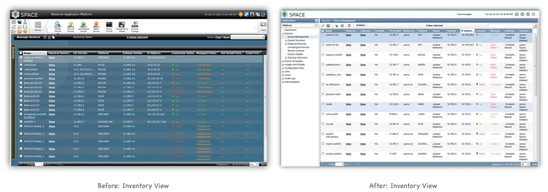

Why the revamp? Navigation Was A Mess
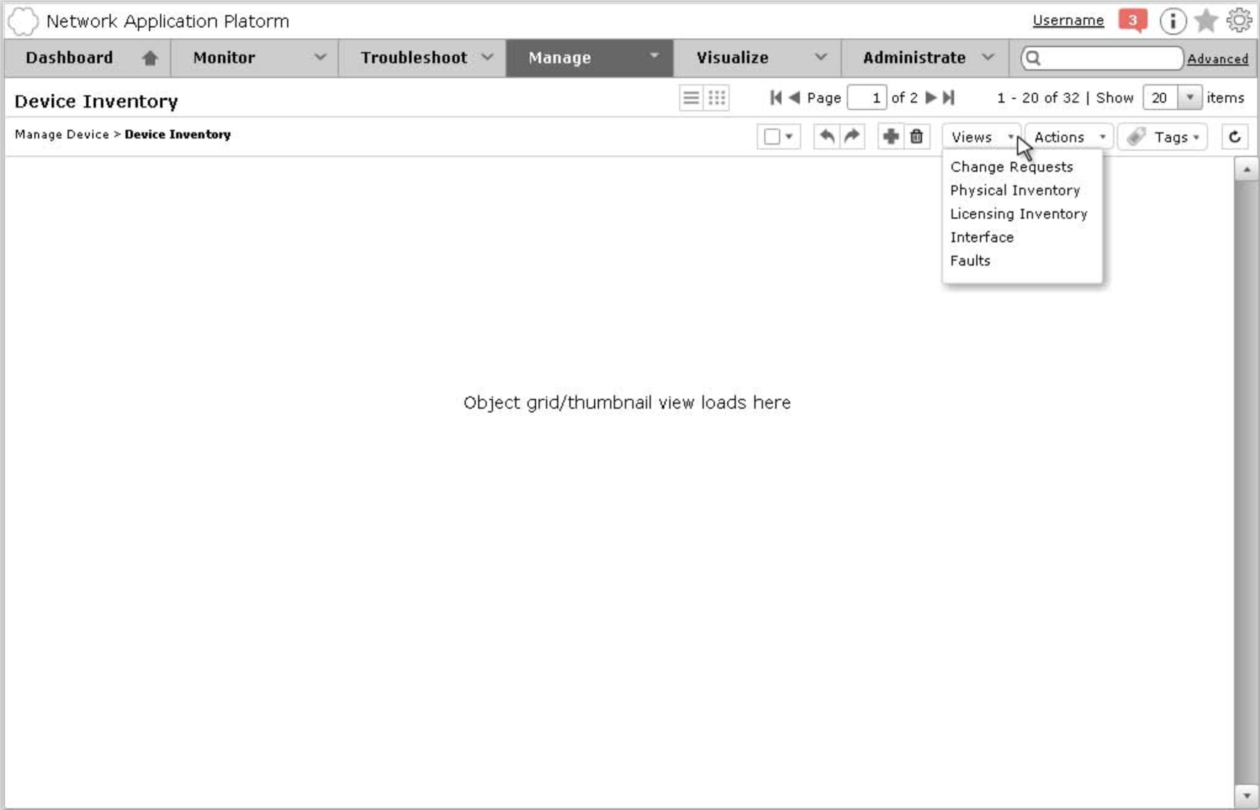
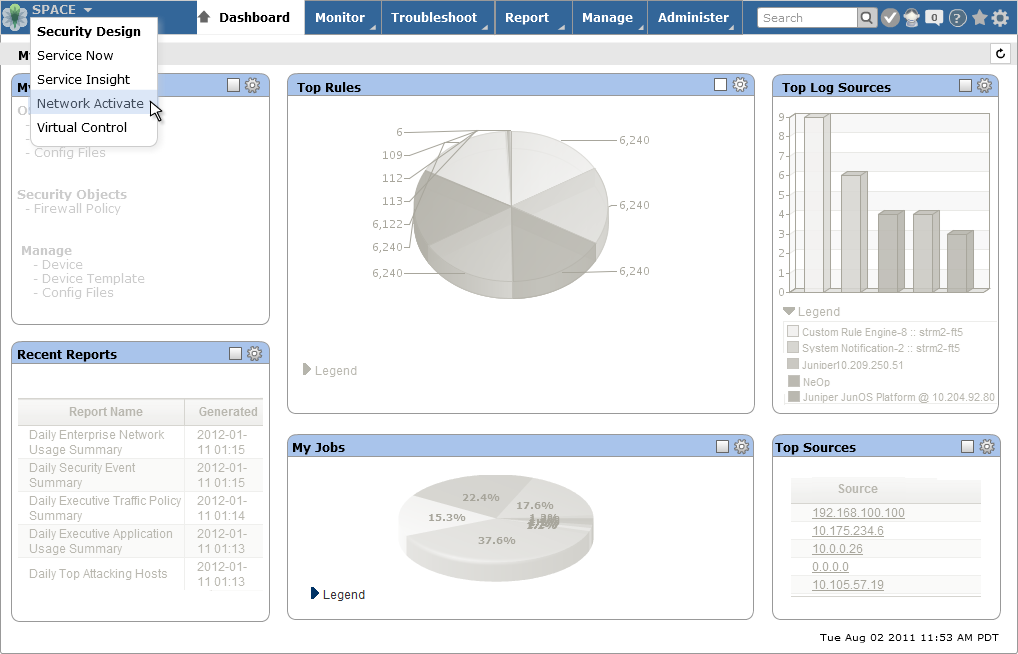
What Junos Space used to look like:
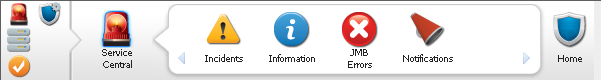
A closer look at the navigation bar, a.k.a. “the ribbon”

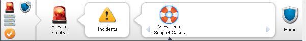
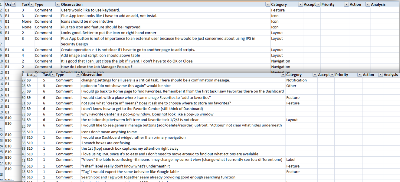
Key Issue #1 - The ribbon did not keep track of users’ visited path.
If users wanted to access the peer tasks, they had to click one level up first then drill down again. Too much time was wasted due to all the extra clicks added up throughout the time.
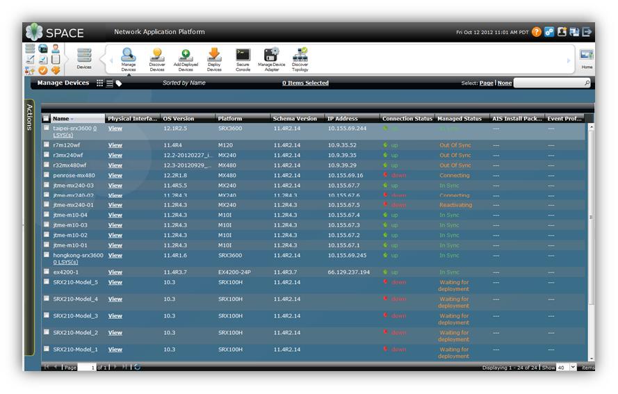
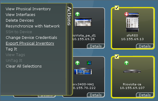
Key Issue #2 - Local navigation was slow & disorganized.
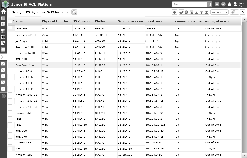
The “Actions” menu was not intuitive. Sliding animation was slow. There were too many actions, and they were disorganized. Right click menu was not discoverable. Users did not find the thumbnail view to be useful, and preferred the table view. All of these local navigation methods did not coordinate well with each other to help the user navigate the Junos Space platform..
Key Issue #3 - Unlabeled icons were difficult to interpret.
Icons were heavily used to represent very abstract and complex network management concepts. The glossy icons, menu bars with drop shadows, and modal dialos with rounded-corners were all composed of heavy images, significantly reducing page loading performance.
Key Issue #4 - Platform behaved like a tenant application
While Junos Space Platform was intended to be a platform for all other Junos applications, it behaved more like a tenant application.
Competitive Analysis & Understand the user needs
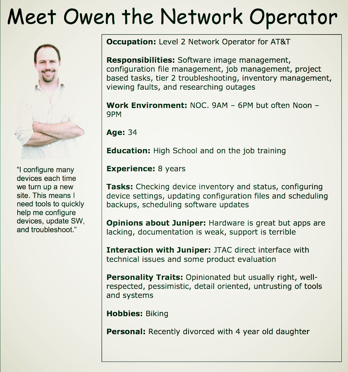
Talking to product managers and internal users (system engineers, sales engineers, etc) was a good start for our user research efforts.. Reviewing and re-evaluating existing personas helped me identify users' primary tasks, workflows and day-to-day challenges. Conducting competitive analysis of Juniper’s competitors' products also gave me a horizontal comparison.
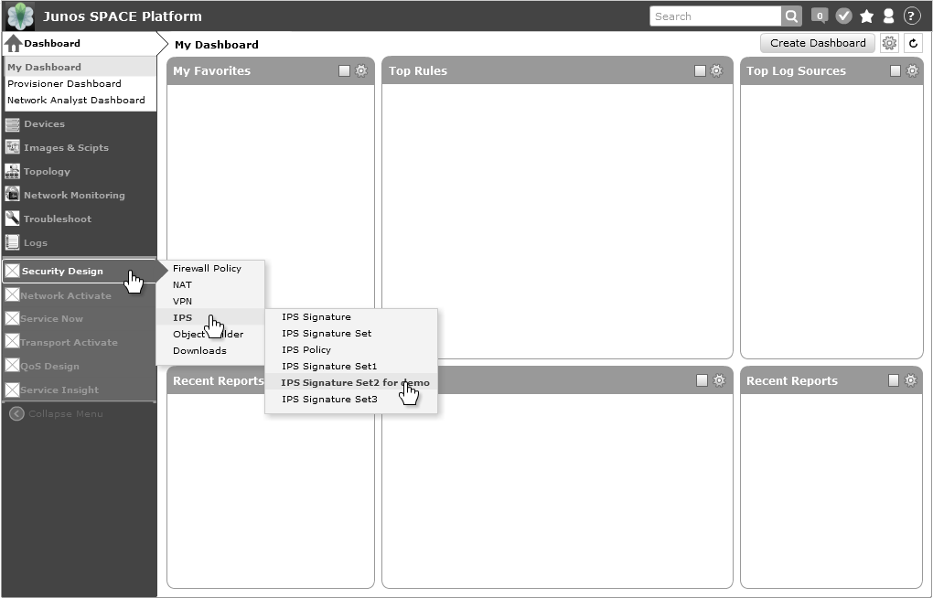
Vision: Junos Space is the "Invisible Platform"
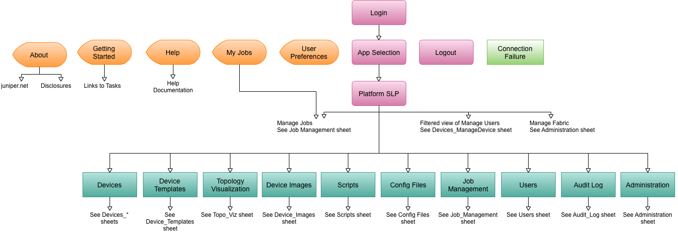
It was important for me to gain an understanding of the existing information architecture. So I collaborated with a colleague to produce a sitemap of the Junos Space Platform.
We started to envision that ideally Junos Space would work like an operating system running on a computer so all Junos applications could run on this “invisible platform”.
Whether the person using Junos Space is a powerful “super user” or a novice first-timer with minimal technique knowledge about networking terminology, they need to traverse through all workspaces or tasks seamlessly from end to end, whether they know first what task they are going to do (task-based), or what object upon which they are going to take action (object-based).

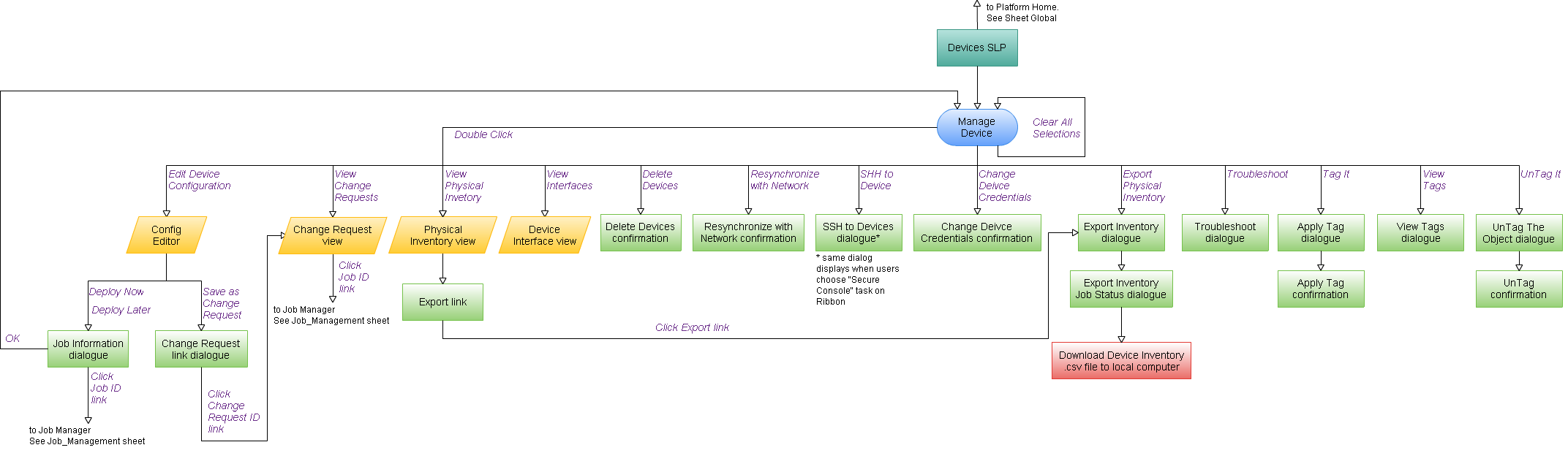
Iteration #1
Our 1st Iteration by August 2011:
Different layout options to see which one might use screen real estate more efficiently
“Back to basics” direction:
Introduced breadcrumb component
Removed the sliding ‘Actions’ drawer and added ‘Actions ‘ and ‘View’ menus
Introduced an advanced selection control in the top checkbox
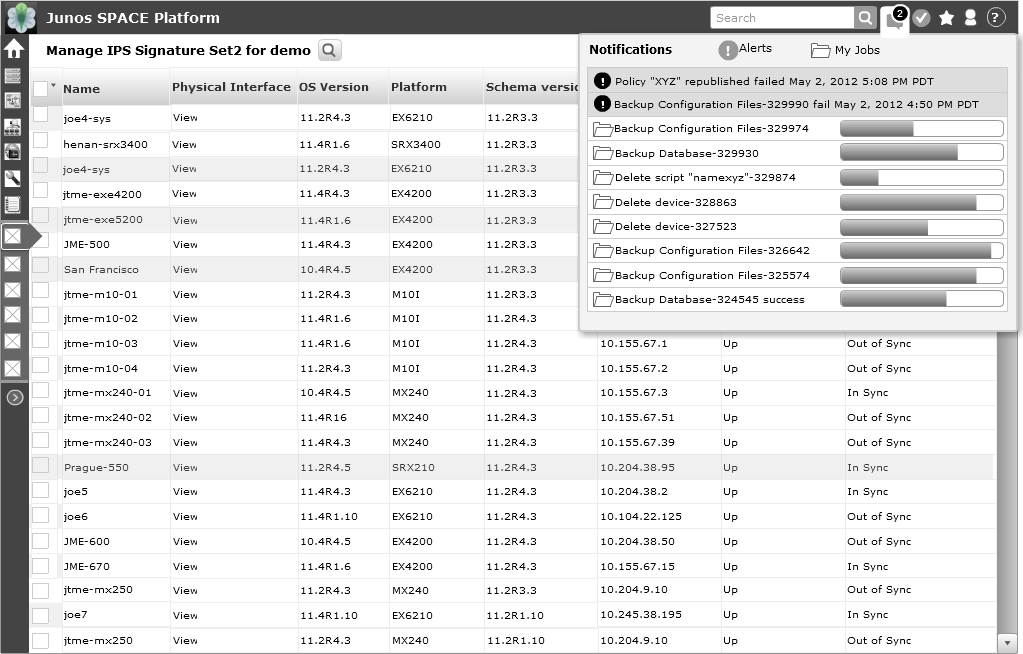
Introduced the ‘Favorites’ and ‘Notifications’ concepts
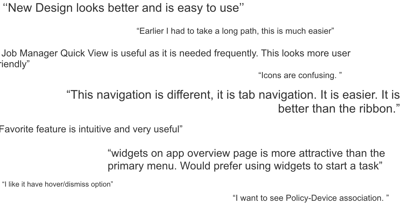
What We Learned
Pro:
"Actions" and "View" provided unified access points to actions.
The "Favorites" and "Notifications" concepts gained positive feedback.
Personalization (System, Dashboard, Home page, Layout) provided flexibility.
Con: Tenant app switching was still not obvious. Needed deeper scale exploration.
Iteration #2
Our progress by January 2012:
Started exploring a specific layout that featured a top-navigation bar with task-based navigation.
Platform as “the application container” still needed features and behaviors to differentiate it from its tenant applications.
We chose the most frequent use case to more fully explore: drilling down into one tenant application.
Provided concept details for Dashboard customizations.
What We Learned
Pro:
Dashboard customization was helpful
Expanding detailed use cases from tenant application provided the context.
Con:
Ambiguous terminology in primary navigation ("Configure" vs. "Manage").
The information architecture hierarchy was still not clear (Platform vs.. tenant application).
Validate the design via PROTOTYpes & User RESEARCH
2012 was a year of workforce reduction. As a team of one in the main office, I carried forward by scoping out the plan for doing user research. My colleague in India, Rashmi, continued to collaborate with me around the clock to develop the click-through prototypes.
We recruited 20+ Juniper colleagues within 2 weeks in both Sunnyvale, California and Bangalore, India. With no research budget being set aside, we successfully conducted multiple 1.5-hour one-on-one usability testing sessions with these voluntary participants who represented well with the personas we had previously identified.
Continue the Iteration with Discoveries from user Research
Important takeaways from user research led us to fine-tune our design:
Replace iconic menus with the text based menus
The main navigation must be flexible enough to accommodate the tenant applications regardless of the scale (less than 4 vs. more than 10)
Ensure quick navigation path between peers
Re-evaluate/investigate taxonomy and menu labels
Test with visual treatments (time to beautify it!)
Differentiate design between “super user”(Admin) and “average user”
Provide details of new features and prioritize
Refresh the Visual Design Guideline for the New Look & Feel
As the Design Lead, I coordinated with my offshore peers in India and China to collaborate around the clock again to refresh the visual design guidelines within a week.
It was not only better aligned with Juniper’s back then corporate branding. It also provided a more neutral and engaging (but not distracting) flavor, and sufficient specification details for the development team.
By reorganizing the visual design guidelines, we managed to tackle most of the key issues and prioritized the solutions based on available resources and technical constraints:
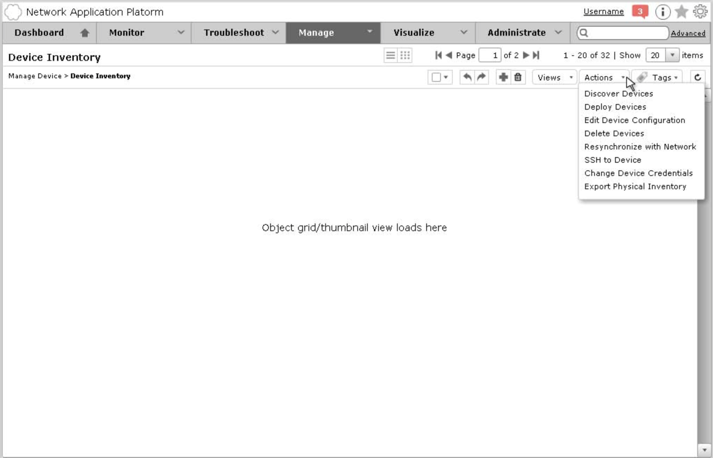
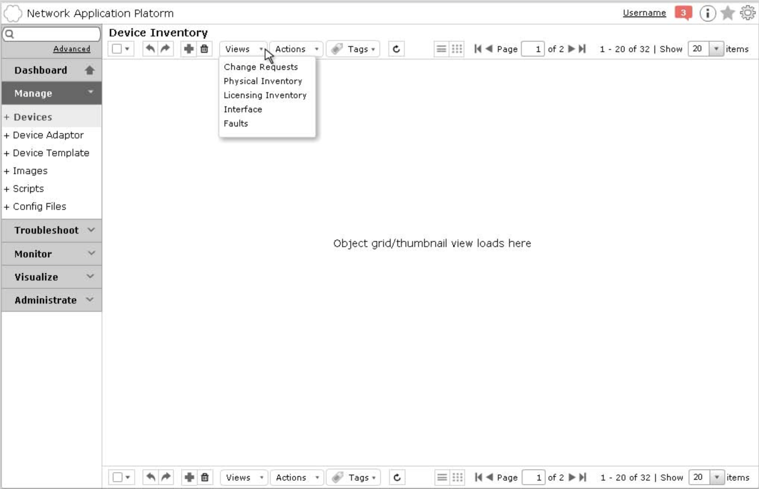
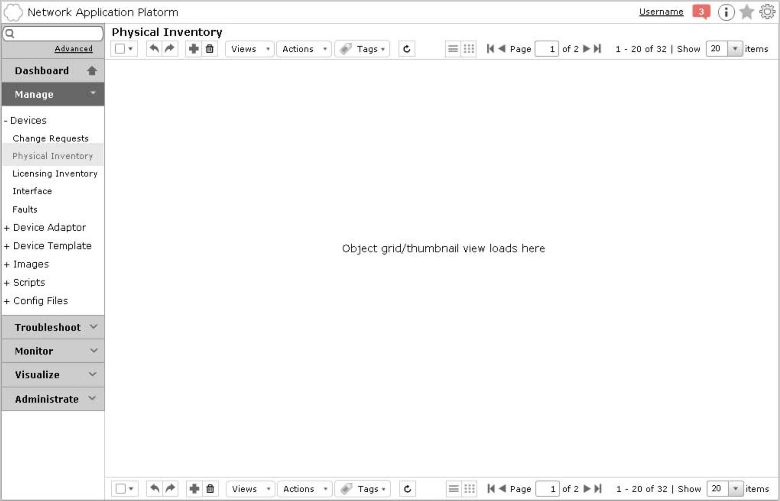
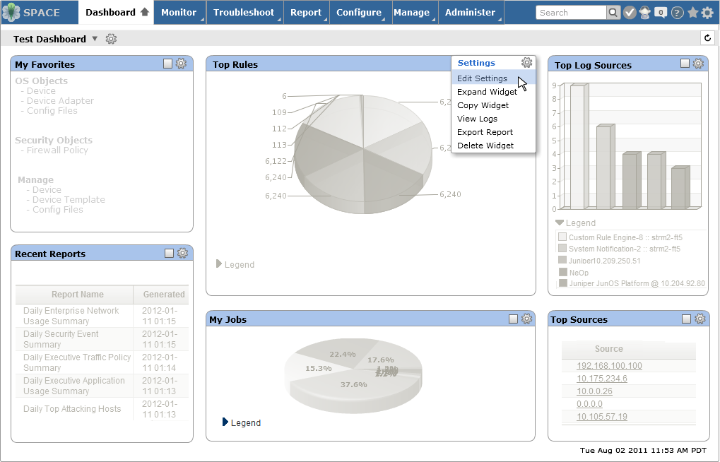
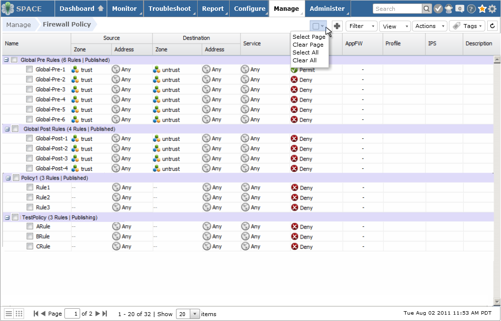
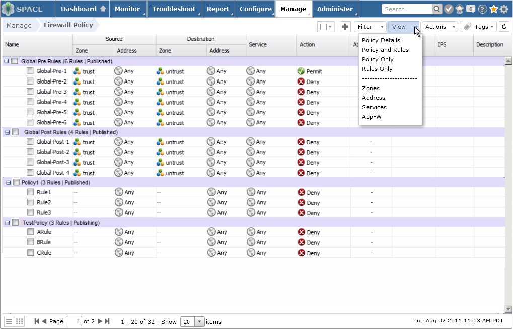
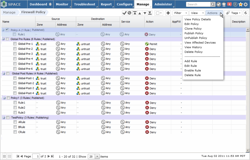
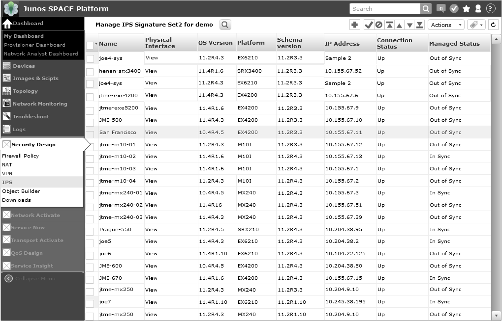
Collapsible standard tree panel component better utilized screen real estate
Breadcrumb supported quick traverse along the users’ visited path
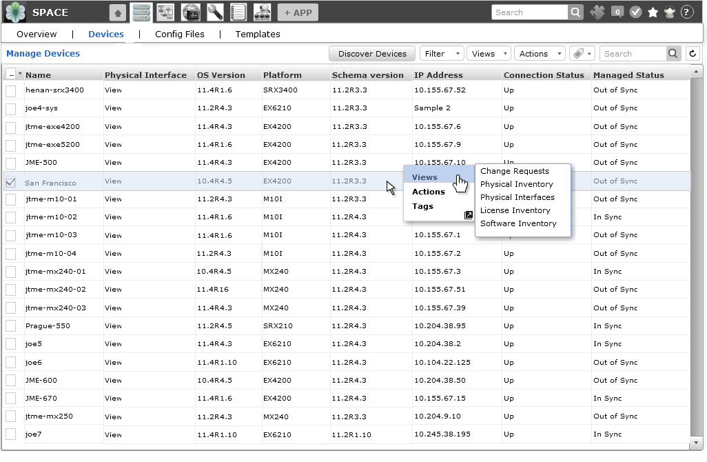
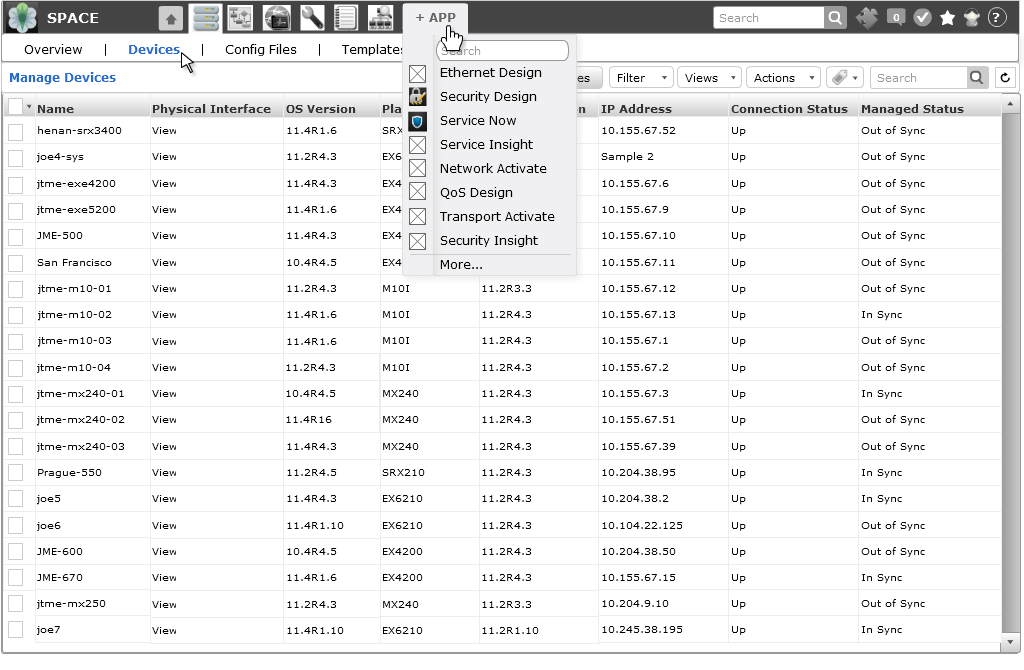
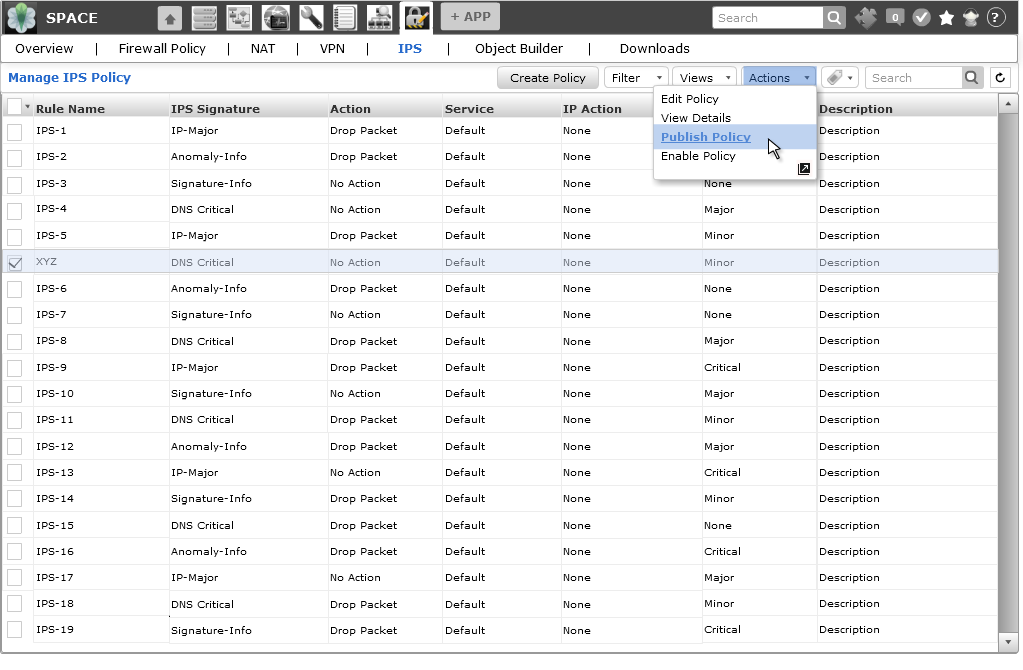
Standardize Menu bar: CRUD operations, Actions & nested submenu
Simplified CSS and reduced use of graphical elements
It was a Team Effort:
Amanda Lyons, UX Manager / Researcher
Matt Welsh, UI Engineer / Visual Designer
Rashmi Singh, Interaction Designer (Bangalore, India)
Fangping Shen, Interaction Designer (Beijing, China)
Xinyu Zhang, UX Manager